What you are downloading
Free template
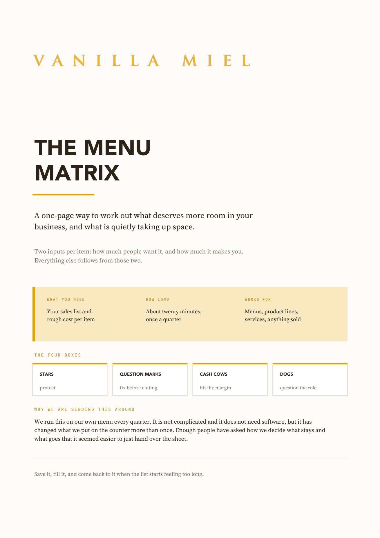
Two numbers decide what should stay on your menu. Score every item on how much people want it and how much it makes you, then sort the lot into four boxes and make four decisions.
What you are downloading
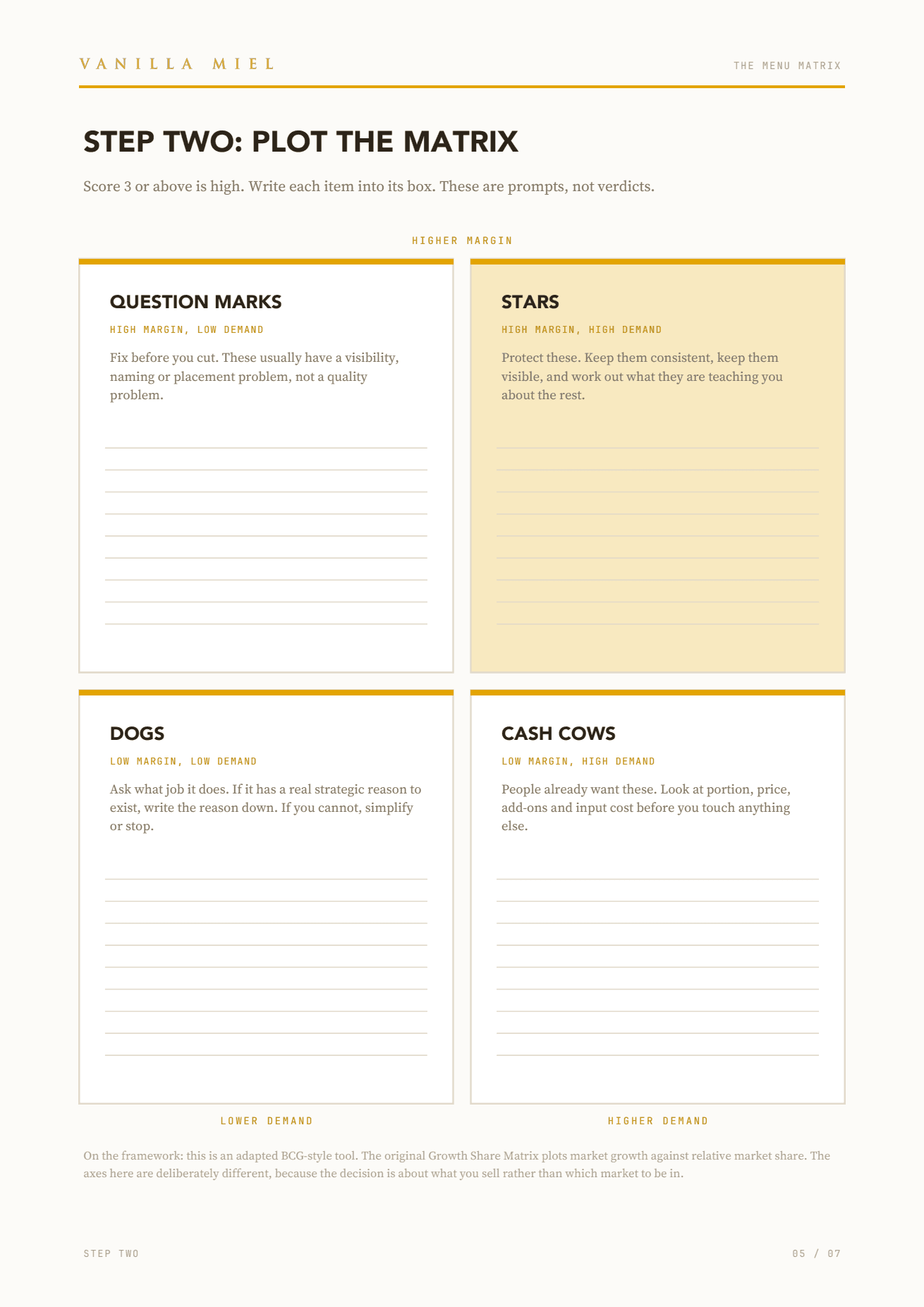
Plot demand against margin and every item you sell lands in one of four boxes. The point is not the grid. The point is that each box carries one instruction, so you leave with a plan rather than a chart.
High margin, high demand
Keep them consistent and keep them visible. Work out what they are teaching you about everything else.
High margin, low demand
These usually have a visibility, naming or placement problem rather than a quality problem.
Low margin, high demand
People already want these. Look at portion, price, add-ons and input cost before touching anything else.
Low margin, low demand
Ask what job it does. If there is a real strategic reason to keep it, write the reason down.
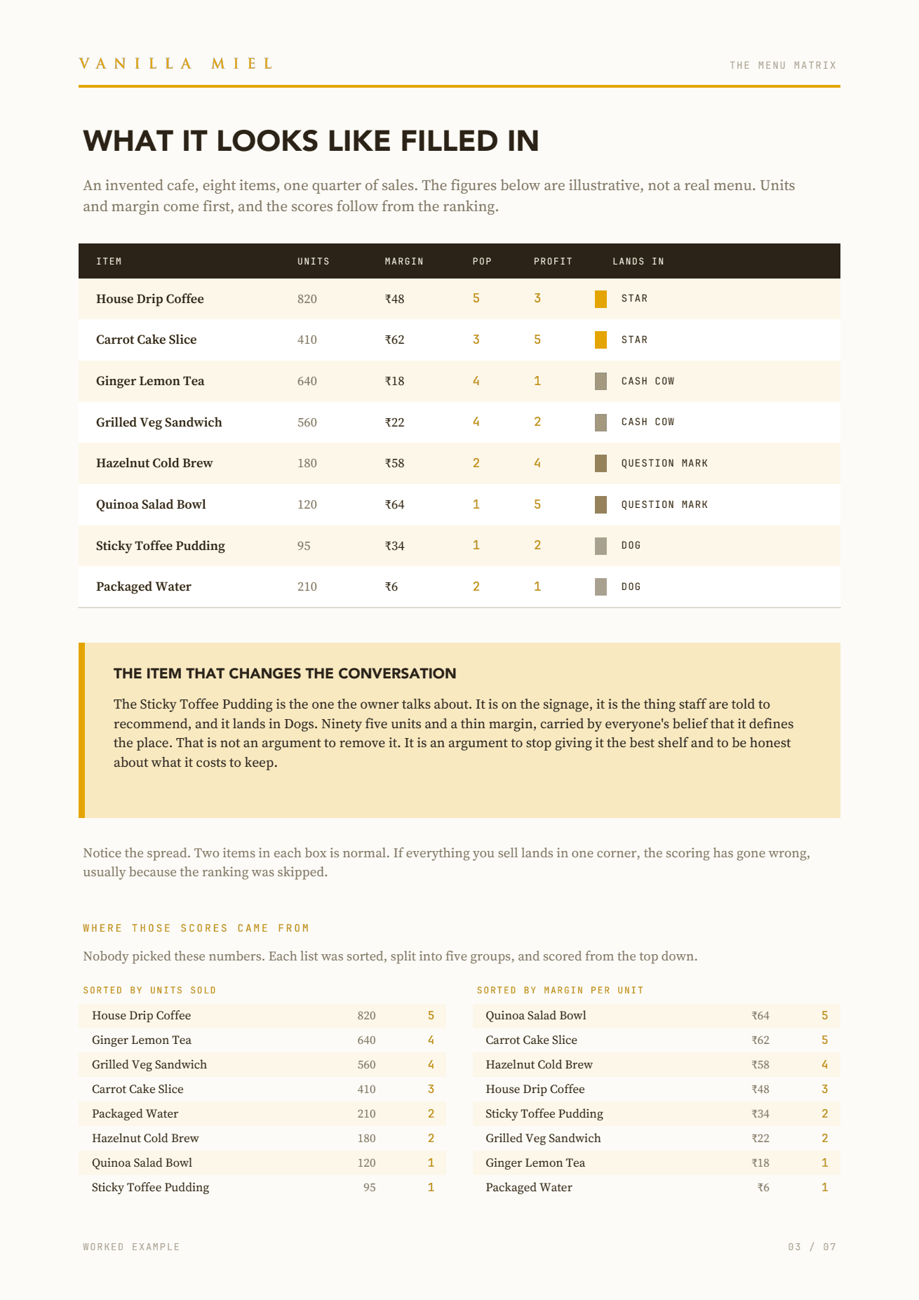
Rank, do not guess. Sort your list by units sold, split it into five groups and score from the top down. Then do the same for margin. You already have an opinion about every item you sell, and that opinion is exactly what the exercise is meant to test. Ranking lets the result disagree with you.
The worksheet is Vanilla Miel’s. They run it on their own menu every quarter across Bandra, Sakinaka and Lower Parel, and enough people asked how they decide what stays and what goes that they made the sheet public.
If you would rather not do it by hand
Nlyten runs this for restaurant groups on live Swiggy, Zomato and POS data, so the matrix rebuilds itself every month instead of once a quarter on paper.
See what we do